2014 Volume Issue 2
January 12, 2014
For a downloadable version, click the following:
Real Story with the Employment Situation Jan 2014 PDF
…a bit more compressed version of the PDF
What’s the Real Story with the Employment Situation?
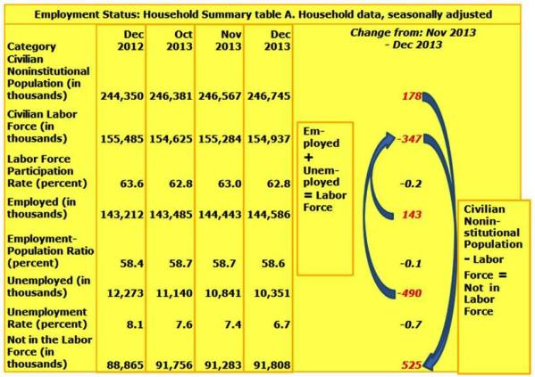
The release of the December 2013 Employment Situation has left us with a disturbing picture of the current state of the labor markets, a condition that has been troubling – to say the least, for the last several years. On the one hand, in the Current Population (or Household) Survey we see an Employment number that is a respectable 143,000 higher than November 2013. Further, we see a reduction of 490,000 from the unemployment rolls. The problems arise from the fact that there were 178,000 adds to the Civilian Noninstitutional Population, but a decline of 347,000 in the Labor Force. Where did those 347,000 people go?
Now the change in Labor Force is equal to the change in the Employed (143,000) plus the change in the Unemployed (-490,000). While there were an added 143,000 in the Employed, when we include the negative 490,000, we end up with 347,000 people leaving the Labor Force altogether. [On a net basis] when we include the 178,000 that were added to the Civilian Noninstitutional Population, this brings the total net increase of the ‘Not in the Labor Force’ category of the Civilian Noninstitutional Population to 525,000. This means that 525,000 more people were removed from the Labor Force (neither employed nor unemployed) in December 2013.
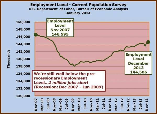
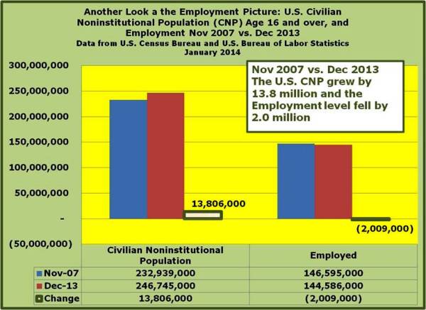
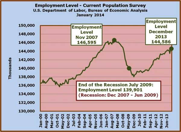
According to the NBER (National Bureau of Economic Research), the US has been out of recession since June 2009. Going back to employment levels in November 2007, since the recession began in December 2007, one would naturally assume that the employment growth would have surpassed that November 2007 level since we are six years down the road. The truth is that we have yet to reach that level of employment, in spite of the fact that we have added around 14 million to the working age population since November 2007.
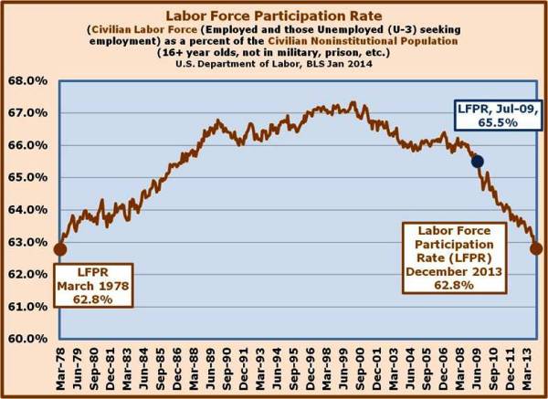
Another bellwether that we’ve been looking at is the Labor Force Participation Rate. This measure from the Civilian Population Survey compares the Civilian Labor Force (Employed + Unemployed) with the Civilian Noninstitutional Population. While the historic measure throughout the last decade (2000-2010) was around 66%, the December reading of 62.8% was the lowest since March 1978.
One of the central themes of this recovery is that we’ve seen the U3 unemployment rate drop at a fairly rapid pace. Now keep in mind that the unemployment rate has dropped a very respectable 1.2%, from 7.9% in January 2013 to 6.7% in December 2013. The main question to ask yourself is did that drop in the unemployment rate result from a movement to the employment side of the Labor Force (again the Labor Force = Employed + Unemployed), or did it result from a movement out of the labor force because of the difficulty of finding jobs?
A key measure of health in the ‘Employment Situation’ is the Labor Force Participation Rate.
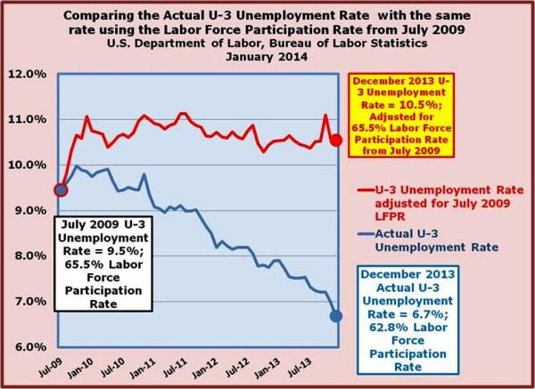
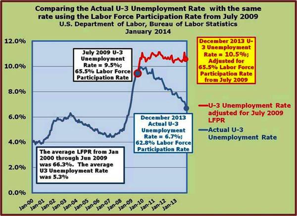
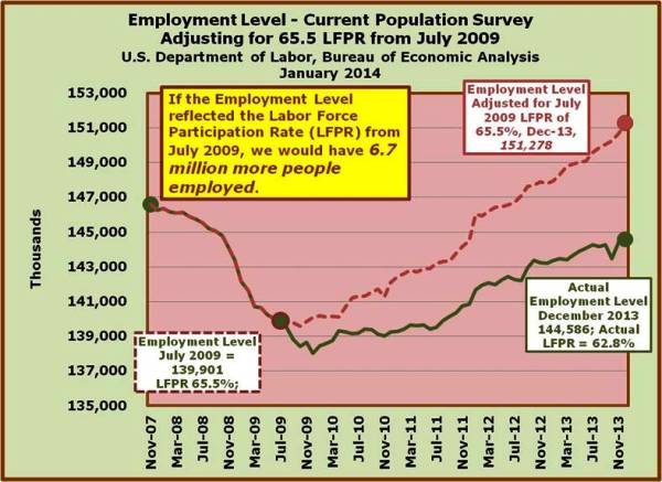
One would hope that the Labor Force Participation Rate would either stay the same (movement from Unemployed to the ranks of the Employed) or rise (movement back into the Labor Force from the ‘Not in the Labor Force’ component of the Civilian Noninstitutional Population). Unfortunately, any ‘Employment Situation’ gains in terms of the reduction in unemployment have translated into a deteriorating Labor Force Participation Rate. In fact, if we were to overlay the Labor Force Participation Rate of 65.5% from July 2009 (the Recession ended in June 2009), we would have a 10.5% U3 Unemployment Rate, not the current 6.7% U3 Unemployment Rate. This is simply because between the change in the Civilian Noninstitutional Population (grew by 10.875 million) and the change in the Labor Force from July 2009 through December 2013 (grew by 435,000), the ‘Not in the Labor Force’ component of the Civilian Noninstitutional Population expanded by (10.440 million). This resulted in a Labor Force Participation Rate that fell from 65.5% in July 2009 to 62.8%.
To illustrate the import of even small changes in the Labor Force Participation Rate, consider this: if the Labor Force Participation Rate had remained at the level it was in July 2009, 65.5%, and that rate was reflected in the employment level (with the same number of unemployed), there would be 6.7 million more people working. These workers, if contributing $50,000 per person to the GDP, would add $335 billion to the economy on an annual basis and roughly $100 billion in new taxes (with at least some offset in terms of unemployment benefits and or other welfare payments such as food stamps).
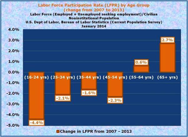
One of the criticisms leveled at the falling Labor Force Participation Rate (LFPR) is that much of the fall-off can be explained by the growing ranks of Baby-Boomers heading for retirement (born 1946 through 1964). While there are certainly retires in that segment, the fact is that the real fall-off in the Labor Force Participation Rate is at the younger ranges of the age groups.
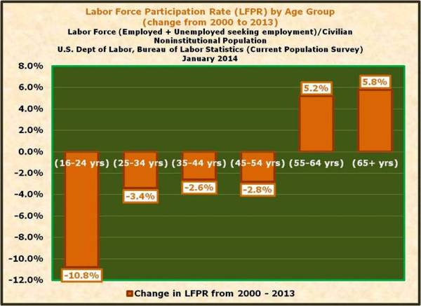
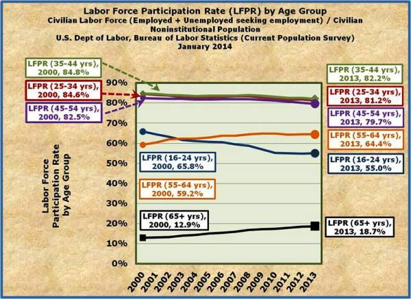
In short, this ‘recovery’ has dealt a blow to labor force participants in their prime earning years (ages 40 to 55). In addition to those segments, it’s also very important to note that the young participants (ages 16-34) have been hurt the most by the lack of opportunities in the labor markets. The irony, of course, is that the older employees are hanging around in far greater numbers.
Lastly, while we’ve covered this ground on several occasions, it bears repeating.
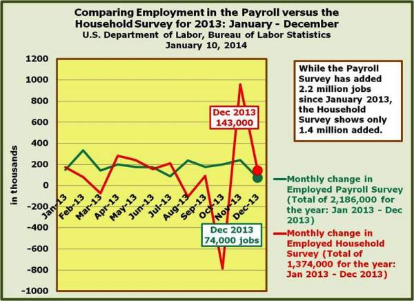
The two surveys we use in determining the Employment Situation on monthly basis are the Payroll or Establishment Survey (also referred to as the Current Employment Statistics or CES) and the Household or the Current Population Survey (CPS). While the Payroll Survey typically gets a bit more notice from the media when the (December 2013) Employment Situation Report is published (typically the first Friday of the month…not the case in January 2014), the Unemployment Rate and a variety of other Employment Situation measures are derived from the Household Survey.
It’s always a good thing to see how many jobs are either created or lost in the Payroll Survey and Household Surveys…